 I loathe “false color” images.
After all, any image that falsifies color must be wildly misleading, right? Who wants that?
Now before anyone gets riled up, let me point out that I simply adore the incredible array of astronomical imagery that represents amazing data collected from across the spectrum, and is lovingly rendered into color representations that we can all enjoy. That is all awesome stuff.
What I hate is the horrifically terrible, yet disturbingly ubiquitous term “false color.”
This is far from a new rant for me, but I figured it would be as good as any place to start for my new astronomyVIZ blog.
Wikipedia (at the moment) defines this terrible term thusly:
False color refers to a group of color rendering methods used to display images in color which were recorded in the visual or non-visual parts of the electromagnetic spectrum.
So why do I hate this term so much? I mean, after all, images that don’t show things the way our eyes see them aren’t true, are they?
Bull*%$t!
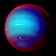
Take the lovely image of Neptune above. It shows the planet through three filters: red, green, and an infrared color that is absorbed by methane gas. That final filter is assigned to the red color of the image, so everything we see as red (or white) reveals high altitude clouds and haze that sit above Neptune’s methane layer. That’s pretty cool, and it is revealed through very real colors, just not exactly the ones our eyes see.
What is false about that? Absolutely nothing!
False Implications
Let us take a minute to consider other similar “false” terms that are in common use:
- False advertising
- False positive
- False witness
- False dichotomy
- False testimony
- False claim
- False… ok you get it…
We have a pretty established linguistic convention that “false ____” refers to something that is an actual misrepresentation of the truth.
In many cases it indicates a premeditated intent to deceive. We do not do that in science.
Damned by Connotation
Words are powerful, and connotations can greatly influence the way people perceive information. This is especially true for the public perception of science, which, let’s face it, is not doing as well as it should at the moment.
I would argue that using a term that carries an insinuation of falsification of data simply opens the door to mistrust of what that data represents. Does that sound like an overreaction? Unfortunately there is evidence to suggest otherwise.
In one instance, consider an otherwise delightful review of a planetary photography exhibit at the Haden Planetarium that appeared in the New York Times. Towards the end of the review he takes a left turn into nonsense as he begins critisizing Hubble (and by association most other astronomical) imagery:
Well, the colors are as phony as the sound. The Hubble pictures are all in black and white; colors are imposed to approximate hues suggested by frequency data… Even the image creators acknowledge they may not resemble what an eye in galactic space might see. Many are colorized far more radically than any 1930s movie.
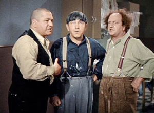
 Ted Turner’s contribution to classic cinema was to have modern artists take black and white film and paint colors on top of it, making completely abritrary decisions as to whether a dress should be red or green. That is colorization.
To insinuate that astronomical imagery taken across the spectrum of light and rendered into hues we can see is phony, and essentially the same thing, really undermines the authenticity of the science in the eyes of the public. Mo’s blue shirt in the colorized version of the Three Stooges is an arbitrary artistic choice. What we represent in multi-band astronomical images is not.
But it’s our own fault if point is not understood by the public when we tell them the colors are “false.”
Our bad. Let’s stop doing that.
Translated Color
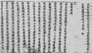
Take a look at the manuscript to the right. It is probably a fair bet that this representation is unreadable to most of you who are successfully reading this blog. It happens to be a page from Sun Tsu’s The Art of War.
This manuscript is far more accessible when presented in our own native tongue, which for most of us is English:
So it is said that if you know your enemies and know yourself, you can win a hundred battles without a single loss.
If you only know yourself, but not your opponent, you may win or may lose.
If you know neither yourself nor your enemy, you will always endanger yourself.
When we take a piece of prose that we can not read and present it in our own language would we call that a false text?
Of course not. We would call it a translation.
Is this really any different than what we do in astronomy? If we have observations taken from parts of the spectrum that we do not see with our own eyes, but then render them into red, green, and blue, we can think of the resulting image as a translation of real colors that we cannot see into colors that we can.
Unfalsifying Color
While I will admit I have not researched this as thoroughly as a historian would, I believe the term “false color” dates back to the early planetary missions in the 1970’s. At that time pretty much any color astronomical image was taken by putting a piece of color film into a telescope. The idea of a color image representing something other than what the eye would see was entirely novel, and needed a term to help people understand this new way of presenting data.
Unfortunately the term “false color” was compact and easy to use. And back then people trusted science so it wasn’t a problem, right?
Sadly, that long history gives the term a lot of inertia and it is commonly invoked today any time an image deviates even slightly from the traditional red-green-blue filters of our own eyes. But that doesn’t mean there are not other good options.
In fact this topic is commonly discussed by members of the astronomy visualization community whenever we get together for workshops. The need to encourage press offices and the media to drop this term in favor of better, more meaningful alternatives is high up on just about everyone’s list of pet peeves.
So what are the alternatives? Some that have been suggested include representative color and translated color. Both are far more meaningful, even if they are not commonly used.
Another good alternative is to simply use a specifically descriptive term that applies to the image in question. For example:
“The colors in this image have been saturation-enhanced to bring out subtle variations…”
“This image shows the infrared colors of…”
“This color-composite combines visible and infrared light…”
“I See Your True Colors…”
Just as I have argued that colors are not false, certainly not in any of the astronomical images I have ever produced, there is a corollary to this idea.
Another common practice in astronomy media is to refer to an image that is a traditional red-green-blue rendering as “true color.” I will spare you the full rant on this, but let me point out that this really does carry a lot of hopefully unintended human hubris.
The idea that out of the entire vast spectrum of light, from gamma rays through radio, only the tiny sliver of light seen by our eyes, sliced into the three filters shared by most humans represent the true colors in the universe is… almost unspeakably arrogant.
There is wonderment to be found in the colors accessible to human eyesight, a fantastic three-dimensional color space of hue and value. I just think it is good to remember a little humility and acknowledge that the particulars of our vision are shaped by a number of accidents of evolution and are no more a “true” representation of the universe than myriad other possibilities.
At the very least, a term like “natural color” avoids the true/false dichotomy and is more meaningfully reflective of the idea that an image is presenting RGB data using an RGB representation that at least loosely recreates its nature.
Of course if you are really hung up on seeing “true color” try turning off your white balance setting on your camera sometime. Indeed, “true” can be a matter of visual debate and is perhaps best avoided for clarity.
Take Up the Fight!
Sun Tsu’s advise is strangely applicable to the battle against misunderstanding while sharing the wonders of science with everyone. Knowing both ourselves (terminology we take for granted) and our enemy (how such terminology can naturally lead to misconceptions) will help us improve our educational strategies to win 100 science education battles!
Please forgive me if I stretched the metaphor a bit far, but I’m on a roll.
I would encourage everyone reading this to take the no-false-color pledge. Let’s all find better ways to explain our visual science to the world.
Remember, colors aren’t false, they’re merely misunderstood!


14 Comments
Thanks for the lesson!
Well said. The translated-text analogy is spot on. Considering how much thought generally goes into such color choices to keep the science intact, slapping the label “false” on it is unfortunate.
Great blog! I can really hear your voice in the writing. Now, when I try a similar rant on colleagues, I can direct them here for better info!
Back in the day, it was always my impression that “false color” meant specifically “color differences represent intensity differences” – we only had ONE filter and (as we still do professionally in ds9) we use a color table to accentuate things. The way the term has now been extended to include what you correctly term ‘translated color’ for 3-band images with real-but-not-visible-light color information is very unfortunate and should indeed be abandoned, banned and ridiculed. When I explain Chandra images to the public I usually use the sound/light frequency analogy and say that I’m playing the same notes but in a different key.
Actually there is another term that works well to describe single band images that have brightness/intensity mapped to a color ramp: pseudo color. While the meaning of the term essentially corresponds to a latinized “false color,” I find it is useful. Pseudo color images truly are using color to represent something that is not color, so the term is meaningful.
Of course, not all pseudo color maps are equal, and I’ve got another rant on that coming up soon!
Reblogged this on Lights in the Dark and commented:
I rarely ever reblog posts, but this is an excellent criticism on the term “false color” and its oft-maligned perception by the modern public, and also a support of coloration techniques used in astronomy to produce beautiful — and scientifically valuable — space images. By Dr. Robert Hurt. Check it out.
I learned and use the term “false color” to mean only a color spectrum substituted for finer gradations in a single-band image (i.e. the original image is grayscale). We referred to images with separate band images mapped to RGB color as “true color”, oddly enough, though I’m not sure if that’s really a good choice either. “Band-shifted color” makes sense to me for images which simply show Infrared->Red, Red->Green, Green->Blue as is common with IR photography.
The term “false color” – as well as its German version “Falschfarb…” – has been used and explained since decades. It says exactly what happens: things are shown in colors are not the real ones. The key is explaining in the caption WHAT happened and what it’s good for: have colors just been enhanced? Are RGB assigned, arbitrarily, to other, perhaps invisible colors? Does color actually mean intensity or density or …? I will continue using the term and encourage others to do the same. Just don’t forget to write good captions.
Right to the point. I already had to explain so many times that what we are showing is just a representation/interpretation of real world data. People often think we are just doing whatever we want. I fully agree with your plea!
I’m so glad that I’m not the only CGI artist or image-compositor who absolutely hates the term “false colour”. (And to me, pseudo-colour isn’t far behind, since the “pseudo” prefix also has negative connotations.) I find “representative colour” to be too cumbersome, but for years I’ve been labelling my own work as TRANSLATED colour, because to me that’s the most accurate description. I’m also usually very careful to state, somewhere in the description of any composited photo, that the image is created by layering multiple images in different spectra. That’s also cumbersome, but it’s my own little disclaimer, as it were. But I have to wonder, how long will it take to make a linguistic shift like this one?
While we’re on the topic of being precise with our words, it would be more accurate to refer to our identification of visible light with “true color” as chauvinism, rather than arrogance or hubris.
is very sad we be believen in this i dont like liers
What a great essay. From now on I am going to say “Translated Color”.
It’s false as far as our experience goes, and that is misleading. You just want to be right about something that irrationally triggers you to write a bloated rant with a poor premise. I lol.
2 Trackbacks/Pingbacks
[…] Read the full article here. […]
[…] timely because astronomer and imaging scientist Robert Hurt just put a blog post up today where he criticizes the use of the term “false color”. In it, he suggests that the term was invented in a much more mature time when the public had a […]